Introduction
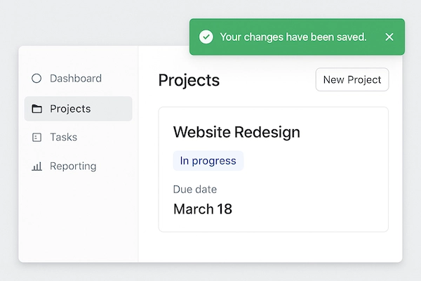
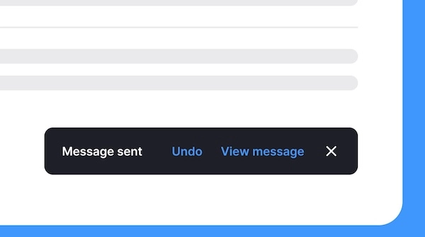
Toast and Snackbar (different but similar) are small, non-intrusive messages that appear on the screen to provide feedback to the user.
They are typically used to display brief messages about the status of an operation or to provide information without requiring user interaction.
Toasts usually disappear automatically after a short period, while Snackbars may require user action to dismiss them.
Elements of Toast and Snackbar
1. Container: An element (div, span or other) that serves as the container for the toast or snackbar message.
2. CSS: CSS is used to style the container and control its appearance, such as background color, text color, font size, and animation for showing and hiding the message.
3. JavaScript: JavaScript is used to control the behavior of the toast or snackbar, such as showing the message when a certain event occurs and hiding it after a specified duration.
Sample code
HTML and JavaScript
	<div id="snackbar" class="toast"></div>

	<button onclick="toastMsg('This is a toast message!')">Show Toast</button>

	<script>
	function toastMsg(msg) {
		var x = document.getElementById("snackbar");
		x.innerHTML = msg;
		x.style.display = "block";
		setTimeout(function () {
			x.style.display = "none";
		}, 2000);
	}
	</script>
CSS
	.toast {
		position: fixed;
		bottom: 20px;
		left: 50%;
		transform: translateX(-50%);
		background-color: #333;
		color: #fff;
		padding: 10px 20px;
		border-radius: 5px;
		animation: fadein 0.5s, fadeout 0.5s 1.5s;
	}
	@keyframes fadein {
		from {opacity: 0;}
		to {opacity: 1;}
	}
	@keyframes fadeout {
		from {opacity: 1;}
		to {opacity: 0;}
	}